Trustpilot is an online review company. At the time I worked there, it had 40 million reviews worldwide from 180,000 businesses. The Trustpilot Business Product is a crucial part of the system, allowing businesses to respond to their customers' reviews, view trends and insights, and get marketing tools.
During my time leading the UX team at Trustpilot, we made some big improvements for our customers that helped us reach key business goals.
Case Study 1: Helping customers complete key tasks
Challenge
During interviews with 14 Trustpilot customers, I discovered that many of them had trouble finding items in the product, creating usability issues and leading to disengagement.
Approach
I redesigned the information architecture (IA) and updated the navigation of the business product. In addition, I worked with a user researcher to understand our users’ journey before and after purchase. My tasks included:
conducting a baseline usability study with new business users to find out whether they could complete key tasks and how long it took
running a remote card sort in Trello with customers to find out how they would ideally arrange our content and tasks in our product
collaborating and iterating with product managers, designers, and engineers to come up with a new IA that made sense for all areas of the product
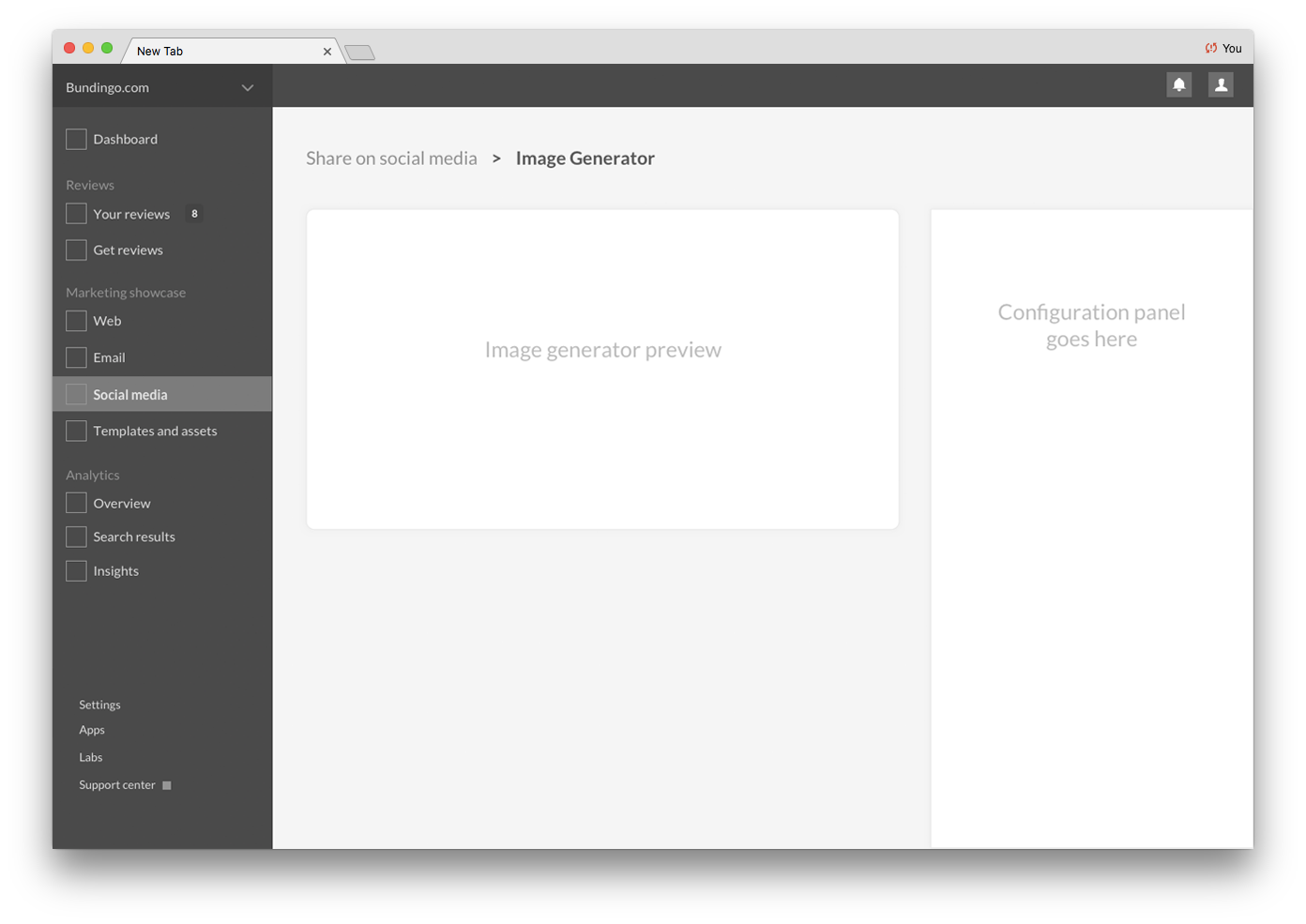
creating wireframes to stress-test the IA and try out ideas for a new navigation
creating a user journey map based on real-world data visualizing our customers’ experiences before and after buying our product
My role
Redesigned the information architecture and navigation
Scoped the project and collaborated with multiple product teams while gathering input from all designers
Created the sketches, IA map, journey map, and wireframes shown below
Quotes from interviewing participants
Detail of the new IA
Our customer journey map was based on user interviews and observations of actual sales calls
New Navigation Sketches
Low-fidelity Wireframes with Redesigned Navigation
Case Study 2: Increasing sales leads
Challenges
From interviews I conducted with our customers, we knew that the upgrade and sales process was painful. Users didn't understand the value of upgrading from within the app, ran into usability issues when trying to upgrade, and needed more information about pricing.
Approach
My team used concept tests, fake door tests, and split testing to create a new in-app upgrade flow for users. We also designed a beautiful new business website with a transparent pricing plan.
Results
The new upgrade flow resulted in a 3x increase in upgrade requests sent to the sales team, and the redesigned business website increased demo requests by 236%.
My Role
Interviewed customers on the upgrade flow and sales process
Gave feedback and direction on the resulting design work
One of the new in-app upgrade screens, designed by Adrian Madacs
Our beautiful and useful new pricing page, designed by Fei Huang
Our beautiful and useful new pricing page, designed by Fei Huang


