Redesigning the intranet for a company of 9,000+ people is a huge undertaking. I worked with a team to completely revamp the information architecture, content, and user experience of our company intranet. Our goal was to create a modern, beautiful, responsive website that would allow employees to get important tasks done quickly.
Results
During the first two weeks after the new intranet launched, the Citrix Human Resources team had a 16% reduction in support calls. In addition, we were honored to win a Design for Experience award.
My role
I worked with four other designers on this project and was personally responsible for the overall content experience, as well as all user research.
Information architecture
I was involved in creating the initial IA with a small, cross-functional core team. Once we had decided on high-level categories for the new intranet, we did a quantitative card sort with 100+ participants using OptimalSort. I also moderated a qualitative card sort with 8 participants to understand why employees were sorting cards into certain categories.
I wrote a case study on our approach to card sorting, which you can find in Baxter and Courage's book Understanding Your Users.
Qualitative user Research
We did user research frequently with employees from every global region. I personally interviewed dozens of employees both onsite and remotely to make sure we understood their needs.
I also created click-through prototypes and planned and moderated usability studies with employees all over the world. I created videos of the results to share recommendations with the rest of the product team.
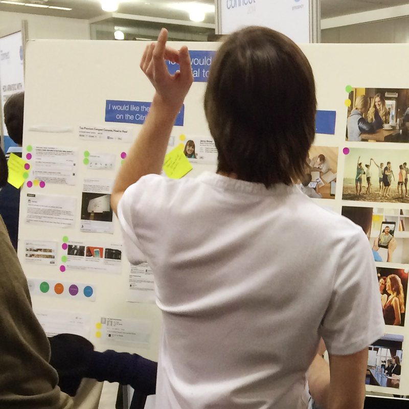
In San Jose, I ran a participatory design session to collect feedback on what elements should be included in employee profiles.
Wireframes
The design team made several different templates for the site that would be used for different types of content. I created wireframes with accordions that let users scan the content and focus on one section at a time.
Content design
The simple infographics that I designed adapt to the screen size, to make sure that users have a great experience on both large and small screens.
Visual design
The final result is a beautiful intranet that feels fresh and focuses on making the content easy to find and consume.
Visual design by Nikita Chikate


